
Now and then, you have a design that gets a lot of appreciation, and you get showered with compliments.
“Looks beautiful.” “Very premium.” “Great colours.” “Love the typography.”
And then… nothing happens.
Nobody clicks. Nobody remembers the brand. The message fails to resonate.
This is one of the most interesting problems in creative marketing: good design is not the same as effective creative design.
A beautifully designed advertisement can fail to hold attention, while a relatively simple piece of creative can stop someone mid-scroll, make them smile, and stick in their mind.
Why? Because people don’t experience creative the way designers create it.
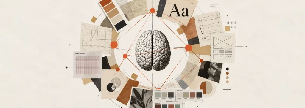
Designers think about composition, typography, colours, grids and balance. Audiences experience creative through attention, emotion, recognition, comprehension and memory.
That difference changes everything.
Attention Comes Before Aesthetics
To appreciate your design, people need to notice it.
Scrolling through Instagram or LinkedIn shows you the innumerable visual elements competing for attention every second. A beautifully balanced graphic that looks perfect on a presentation slide may disappear completely in a crowded feed.
This is why attention is often more important than aesthetics.
CRED, for example, has built much of its communication around unexpected visual worlds, humour and unusual storytelling. The creative isn’t simply trying to look attractive. It is trying to create a moment of “Wait, what is this?”
That pause is valuable. Effective creative design first earns attention. Only then can aesthetics work.
More Information Can Actually Mean Less Understanding
One of the easiest mistakes in creative communication is trying to say everything.
A product has ten features, so the designer crams all ten features on the creative. A company has twenty services, so the brochure lists all of the twenty services with their USPs.
The result is technically informative but cognitively exhausting.
Our brains naturally try to simplify what they see. When everything is presented with equal importance, the audience has to decide what matters.
That is where visual hierarchy becomes important.
A strong creative tells the viewer, almost instinctively:
Look here first.
Then here.
Then here.
And finally, take action.
Zomato’s communication has often demonstrated this principle through short copy, strong visual focus and a clear relationship between the message and the moment.
The lesson isn’t “make your design look like Zomato.”
But to understand that clarity is a creative advantage.
Visual Hierarchy Is a Conversation
Imagine walking into a restaurant where every waiter is shouting at you simultaneously.
“Today’s special!”
“Try our dessert!”
“Here’s the menu!”
“Free delivery!”
“New dish!”
You wouldn’t know what to listen to.
Creative works in much the same way.
Headline, image, supporting copy, logo, CTA and product information all compete for attention. If they are given equal visual weight, nothing feels important.
Good hierarchy creates a conversation.
The headline attracts attention. The visual creates context. Supporting information builds understanding. The CTA tells the audience what to do next.
It sounds simple. But getting that order right is often where the real creative thinking happens.
Colour Is Not Decoration
Colour can influence perception before someone consciously reads a single word.
A colour can make a product feel energetic, luxurious, playful, trustworthy, natural or premium. But context matters.
The same colour can communicate something completely different depending on the category, audience and surrounding visual language.
Think about Tanishq.
Its visual identity frequently uses colour, photography, space and typography to create a sense of refinement and occasion. The objective isn’t simply to make jewellery look attractive. The creative reinforces the emotional meaning surrounding jewellery: celebration, relationships, milestones and aspiration.
That is the difference between choosing a colour and using colour strategically.
Typography Has a Voice
Typography is often treated as a finishing decision.
It shouldn’t be. A typeface can feel authoritative, playful, sophisticated, modern, traditional or informal before the audience has processed the actual words.
Imagine a luxury jewellery brand communicating in a typeface that feels like a children’s birthday invitation.
The words could be perfect. The perception would still be wrong. Typography visualises the brand’s voice. It determines how the message feels before the message is fully understood.
Sometimes the Most Important Design Element Is Nothing
Whitespace is often misunderstood as unused space.
It is far from that. Whitespace acts as a breather, giving the eye somewhere to rest. It separates ideas, creates emphasis and prevents visual information from becoming one large block.
Look at premium packaging. Often, the product isn’t surrounded by endless information. The brand name, product and essential details are given room to breathe.
That space communicates confidence. It says: we don’t need to shout.
The same principle applies to a website, presentation, advertisement or social media post.
Good design isn’t about filling available space. It is about deciding what deserves space.
Design for the Audience, Not the Designer
This is perhaps the most important shift. Designers naturally develop preferences. Clients do too.
“This looks premium.”
“I like this colour.”
“This font feels modern.”
But the important question isn’t:
Do we like it?
But
Will the intended audience understand, notice and remember it?
Consider Amul.
Its communication doesn’t try to win design awards through visual complexity. Instead, it has built recognition through a remarkably consistent visual world, topical humour and a character people instantly associate with the brand.
That consistency has become an asset. The creative works because the audience already knows how to interpret it.
Consistency Creates Recognition
Imagine seeing the Amul girl without the Amul logo.
There is a good chance many people would still know the brand. That is the power of distinctive visual identity.
Recognition doesn’t happen just because a logo is shown repeatedly. It develops when colours, typography, imagery, tone, shapes, characters and communication patterns work together consistently over time.
Paper Boat is another useful example. Its packaging and communication have historically leaned into nostalgia, storytelling and Indian cultural associations.
The visual identity doesn’t merely identify a beverage. It helps communicate what the brand wants the beverage to make you feel.
That is visual identity working beyond aesthetics.
Packaging: Your Silent Salesperson
A consumer may never speak to the person who designed a product’s packaging.
They may never visit the company’s website or see its advertisement.
But they might stand in front of a shelf and decide in three seconds based on how it’s packaged.
Packaging has an unusual job: while it must store its contents faithfully, it additionally has to attract attention, communicate category, create differentiation and help establish perceived value, without anyone explaining it.
This is where creative becomes commercial.
The bottle, box, label, typography, colour and photography aren’t separate design decisions. Together, they become the product’s first sales conversation.
B2B Creative Has a Different Job
Creative for B2C and B2B audiences shouldn’t look the same.
A consumer campaign may have seconds to create curiosity or emotional connection. A B2B creative often needs to establish relevance, credibility and clarity much faster.
Imagine an industrial equipment manufacturer promoting a complex machine.
A dramatic lifestyle photograph might look visually impressive. But it may not get decision-makers’ attention, because they want to know what problem it solves, who it is for, what makes it different from what they may already have, and what evidence supports the claim.
Effective creative design for B2B doesn’t have to be boring. It just needs to understand that attention and trust often connect to different triggers.
Beautiful Isn’t the Same as Effective
This is where the distinction becomes important.
Beautiful design asks:
“Does this look good?”
Effective creative design asks:
“Does this do what it needs to do?”
Sometimes the answer is both.
Sometimes it isn’t.
The campaign objective may be to generate awareness. A social post may need to maximise engagement. A packaging design may need to stand out on a crowded shelf. A presentation may need to make a complex idea easy to understand.
The creative solution should begin with the objective, not with a blank canvas.
At KERTUS, we see creative services as more than making things look polished.
The real work happens before the design begins: understanding the audience, the business objective, the context and the behaviour we want to influence.
Because the best creative isn’t necessarily the one people describe as beautiful.
It is the one they notice, understand, remember and act on.
And sometimes, the smartest design decision isn’t adding another element.
It is knowing what to leave out.